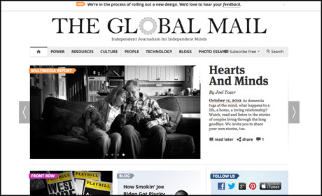
The Global Mail, a Sydney-based non-profit news site, showcased its new design this week, which included a move from horizontal to vertical scrolling, as well as a new carousel of featured stories and its first "dedicated mini-site" focused on a single topic.
Speaking to Journalism.co.uk via email, chief executive Jane Nicholls outlined further the thinking behind some of the new features, such as its move away from horizontal scrolling for the site as a whole, both for ease of use and to illustrate a level of content hierarchy to its audience.
"The problem with the horizontal scrolling was that it moved content out of view too quickly - stories that had been reported over weeks could be pushed off the home page within a day.
"Also, it robbed us of any sense of content hierarchy. So while our launch home page was on the face of it a beautiful, rich design, it tied our hands in so many ways."
Other new elements of the design include a carousel containing four "featured stories" - shown in the image above - as well as story lists such as a "most wanted" collection of other top stories and a "news from elsewhere" curated list of content from the wider web.
Another change is the addition of its first "dedicated mini site", which features a "multimedia package of stories on people living with Alzeheimer's".
The content is fuelled by the audience, which is asked to "share their own experiences", she said. "That will be something we can build on, and we plan to create similar projects on other topics."
The site also unveiled its first interactive tool centred on the Australian federal budget, which enables users to move sliders to dictate how they would distribute the dollars.
She said the site will "be working on more of these in the future, as well as data visualisations".
- For more on news site design and user experience listen to Journalism.co.uk's recent podcast on the subject
Free daily newsletter
If you like our news and feature articles, you can sign up to receive our free daily (Mon-Fri) email newsletter (mobile friendly).
Related articles
- How NBC News designs digital products with the audience in mind
- Media24 is training students in South Africa to set up news websites for their schools
- How Quartz redesigned its homepage to showcase different storytelling formats
- Libération's new website marks the start of a digital-first initiative
- How Quartz strives to be an 'ever-evolving' platform


