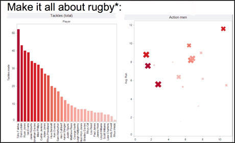
*May only work in Wales - rugby visualisation by Wales Online
At one of the sessions at news:rewired – full stream ahead, Journalism.co.uk's conference on digital journalism that took place on Friday (13 July), a panel of fantastic data specialists were assembled to talk about what they do best.
Bella Hurrell, specials editor on the BBC News website, James Ball of the Guardian, Claire Miller of Wales Online and Damian Kimmelman, chief executive of Duedil shared their advice on getting more out of data and data-based stories. Here are their top tips:
1. Pick subjects with a shelf life and update the data. The BBC keeps track of military deaths in Afghanistan and links to this data from every story about a military death.
2. Make tools, databases and apps that your readers will want to return to. Sticky data that continues to be useful is better than one-off, time-sensitive pieces.
3. It should be easy for users to share your feature. Allow people to embed your data or make it easy to link to.
4. Plan the publication and partner with a range of outlets for maximum coverage.
5. Remember to re-promote the features regularly.
6. Make sure they work on tablets and mobiles, where appropriate.
7. People like maps. It gives an easy-to-grasp sense of what is relevant and local to them.
8. Show data that your audience is interested in. For example, at Wales Online rugby stories prove to be very popular.
The golden rule
9. Your data won’t tell you the question.
Looking at the data is a really bad way to find a story. James Ball pointed out you wouldn’t ring up a source and ask if they have a story for you, so don’t do this to your data. Use old-fashioned journalism skills to get the best out of your data by networking, talking to people and reading comments and emails.
On visualisations
10. Help your readers to understand something complex rather than just making data art.
11. But make it sexy. Most people did not enjoy maths at school so don’t bombard them with pie charts and bar charts.
12. Test your designs and use your feedback to make it better next time.
13. Keep the interface simple, intuitive and easy to use.
14. Avoid too many choices as that can lead to user anxiety.
15. Guide users through your visual. Sequential 'next' options will often get more clicks than 'explore'.
16. Consider audio commentary or using video production tools like After Effects to give an overview.
This is cross-posted from news:rewired.
- The next news:rewired will take place on 23 November 2012 at MSN UK, London. For more information follow the news:rewired website. For tickets at the early-bird rate of £95 (+VAT) click here.
Free daily newsletter
If you like our news and feature articles, you can sign up to receive our free daily (Mon-Fri) email newsletter (mobile friendly).
Related articles
- Why DC Thomson's data journalists are keeping tabs on high street businesses
- Tackling new challenges for data journalism, with DC Thomson's Lesley-Anne Kelly and Ema Sabljak
- Journalism and media events in 2024 and 2025
- What can generative AI actually do for ordinary journalists?
- 'Journalism is extraordinarily resilient in the face of pressure and change'


