If you're a working journalist, then you're probably familiar with the idea of style guides: documents that specify preferred spellings, capitalisation, acronyms as well as document styles for a particular publication; the Guardian's for example. As interest in publishing data grows, inspired in part by official releases of US Government data at http://data.gov, and through the Guardian newspaper's OpenPlatform DataStore, it's maybe worth pausing for a moment to ask whether we need consistent style guides for data, compared with a more laissez faire attitude to publishing data more or less as it comes.
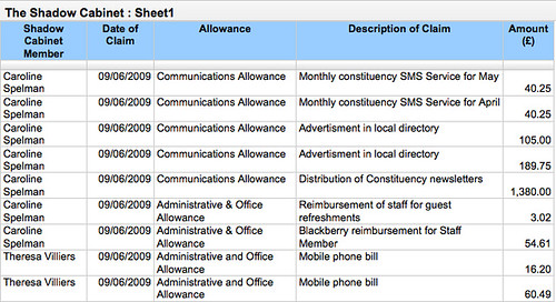
So what issues might a style guide for data address? To give us something concrete to talk around, consider the spreadsheet of Shadow Cabinet member expenses, as published by the Conservative Party (Google the Shadow Cabinet's expenses; and the actual Shadow Cabinet's expenses spreadsheet).

This document is published as a public document on Google Spreadsheets, the same platform that is used by the Guardian DataStore, where it can be viewed without any need for authentication. If you have a Google account, you can also make a copy of the spreadsheet and then use that copy to plot charts or analyse the data as you require.
Being a Google spreadsheet, it is possible to interrogate the spreadsheet in a variety of ways via an API (Application Programming Interface), which allows you to treat the spreadsheet almost as if it were a database. The details are rather too technical to mention here - follow my blog for greater depth - but suffice it to say that it is possible to construct a wide variety of URIs that can request a wide variety of different reports based on the data contained in the spreadsheet.
So for example, one thing we can do with the Shadow Cabinet expenses spreadsheet is to request a summary report that contains the total expenses claimed by each member by expenses category:

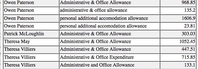
So what do we see here? The report is generated by identifying unique 'strings' of text in the Shadow Cabinet member and Allowance columns, and then summing the expenses for every claim made against each name and category. The spreadsheet works by identifying exact text matches, which is why Theresa Villiers' Administrative & Office Expenditure and Administrative and Office Allowance are identified as two different types of claim.
This inconsistency arises through the failure to adopt a very strict convention about how to categorise expenses claims even within the same spreadsheet. These conventions can be trivially enforced by using a form to enter the expenses details, with categories selected from a drop down list, for example. Incidentally, the Google Forms application stores results from completed forms in a Google spreadsheets and could potentially be used to provide a handy interface to the expenses spreadsheet.
Can you see any other inconsistencies in the expenses to date? How about Owen Paterson's claims? Problems such as this are compounded once we start trying to maintain consistency across different spreadsheets. Taking the Guardian DataStore Higher Education spreadsheets as an example, we see different naming conventions used for the Higher Education Insititutions across the national Survey and Dropout spreadsheets.
The following image (follow link to view on Flickr) shows results being pulled in to a single Google spreadsheet from two Guardian DataStore spreadsheets using the HEI search term 'Glasgow':

To the human eye, it's easy enough to identify which of the differently presented (that is, differently styled) names map on to each other, but the inconsistent naming means that it becomes difficult to create a combined report that pulls back data from spreadsheets using different naming conventions.
So, for example, what search term could I use to display just the results for Glasgow University? Although both the Conservative Party Shadow Cabinet Expenses spreadsheet and the Guardian DataStore are relatively young resources, they already present a range of problems to the journalist wanting to produce summary reports from them, or data mash-ups by combining them.
In the first case, we have an example of inconsistent styling within a single spreadsheet; in the second case, we have inconsistencies across several different spreadsheets.
But, by adopting something akin to a data style guide these simple errors can be avoided, and the resulting data resources will be more valuable as a result.
Free daily newsletter
If you like our news and feature articles, you can sign up to receive our free daily (Mon-Fri) email newsletter (mobile friendly).


